It's one of the most common and costly mistakes in Google Ads: sending expensive, hard-won traffic straight to your website's homepage. Don't do it.
For your Google Ads to really perform, you need a true conversion landing page. This isn't just another page on your website; it's a standalone, laser-focused page built for one single purpose—to turn that click into a lead. It works by creating a simple, distraction-free path from your ad right to the conversion.
Why Your Homepage Kills Google Ads Performance
Think about it. You've just spent good money on a click. But that user lands on your homepage and is immediately overwhelmed. They see links to your 'About Us' page, your blog, your company history, and a dozen different services. Your homepage is a jack-of-all-trades, designed to guide all kinds of visitors. For paid traffic, that’s a fatal flaw.
Someone who clicked a Google Ad for a specific problem doesn't want to browse. They want a solution, and they want it now. When they land on a busy page with competing messages, their focus shatters. Most won't bother to hunt for the information they came for. They'll just leave. And you just paid for that click.
General Website Page Vs Dedicated Landing Page
To really see the difference, let’s break down how a general page stacks up against a purpose-built landing page for a PPC campaign.
| Feature | General Website Page | Dedicated Landing Page |
|---|---|---|
| Goal | General exploration, branding | Single conversion action (e.g., call, form fill) |
| Navigation | Full site menu (About, Services, Blog) | None, or limited to the page |
| Content | Broad, covers multiple topics | Highly specific, matches the ad |
| Calls to Action | Multiple, often competing (e.g., Read More, Contact Us) | One clear, primary CTA |
| Audience | Everyone (new visitors, existing customers) | Highly targeted ad-click traffic |
| Result | High bounce rate, low conversion | Low bounce rate, high conversion |
The table makes it pretty clear. A dedicated landing page is an essential tool, not just a "nice-to-have," for any serious Google Ads campaign. It’s engineered from the ground up to convert.
The Secret Ingredient: Message Match
The magic behind a high-converting campaign is a simple concept called message match. This is all about creating a seamless link between your keywords, your ad copy, and your landing page. When what a user reads in your ad is exactly what they see on your page, you build instant trust.
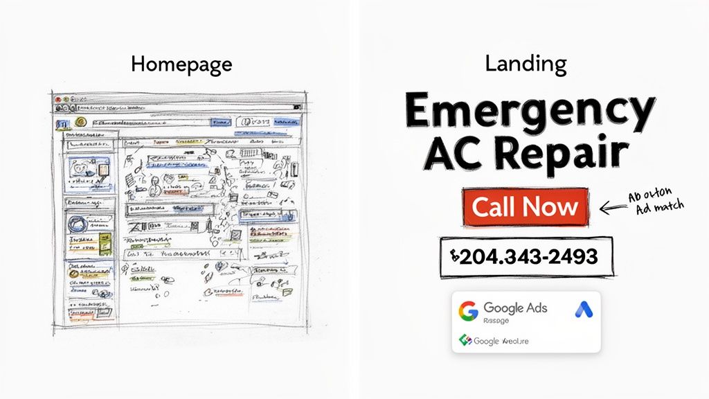
Let's look at an example. A user searches for "emergency AC repair in Phoenix."
- Keyword:
emergency AC repair Phoenix - Ad Headline: Emergency AC Repair – 24/7 Service in Phoenix
- Landing Page Headline: Need Emergency AC Repair in Phoenix? We're On Our Way.
See how smooth that is? It reassures the user they’re in the right place.
Now, imagine sending that same person to a general HVAC homepage talking about furnace installations and maintenance plans. It's a jarring disconnect. That mismatch creates confusion and makes them hit the back button.
How Message Match Directly Impacts Your Wallet
Google loves it when you give users a great experience, and they reward you for it. Strong message match is a massive factor in your Quality Score—the metric Google uses to rate the relevance of your ads, keywords, and landing pages.
A high Quality Score leads directly to two things every advertiser wants:
- Lower Cost-Per-Click (CPC): You literally pay less for each click than competitors with lower scores.
- Better Ad Positions: Your ads show up higher on the search results page, getting you more visibility.
By using dedicated landing pages that nail message match, you're not just improving the user experience. You're making your Google Ads budget work much, much harder.
A Quick Real-World Scenario
Let's picture an HVAC company running Google Ads on a hot Saturday afternoon. A homeowner’s AC dies. They frantically search for "emergency AC repair" and click an ad.
- Scenario A (Homepage): They land on a page with promos for new systems, blog posts, and a full navigation menu. Annoyed and in a rush, they leave and click the next ad in the search results. Money wasted.
- Scenario B (Dedicated Landing Page): They land on a page with a big, bold headline: "24/7 Emergency AC Repair." Right below it is a "Call Now" button, a simple form, and a few testimonials. The choice is obvious and easy. Lead captured.
The proof is in the numbers. Dedicated landing pages consistently outperform other signup methods, converting 160% better on average. Across all industries, the median conversion rate is 6.6%, and a massive 86% of top-performing pages are mobile-friendly. You can explore more landing page statistics to see the full impact.
The takeaway is simple: crafting direct, focused landing pages that perfectly match your ad copy is the key to reducing friction and maximizing your ROI. And once you capture that lead, speed is everything.
The Anatomy Of A High-Converting Landing Page
A great landing page isn't just a webpage; it's a finely-tuned machine built for one specific purpose. Think of it less like a digital brochure and more like a focused, persuasive conversation where every single element—every word, every image—is pulling in the same direction.
To get this right, you have to understand the core principles of conversion design. It's a blend of art and science, mixing psychology with clean aesthetics to guide a visitor toward taking action. It's all about understanding what makes someone tick and then systematically removing any friction that might make them hesitate.
Let's break down the essential pieces that make a simple page a lead-generating powerhouse.
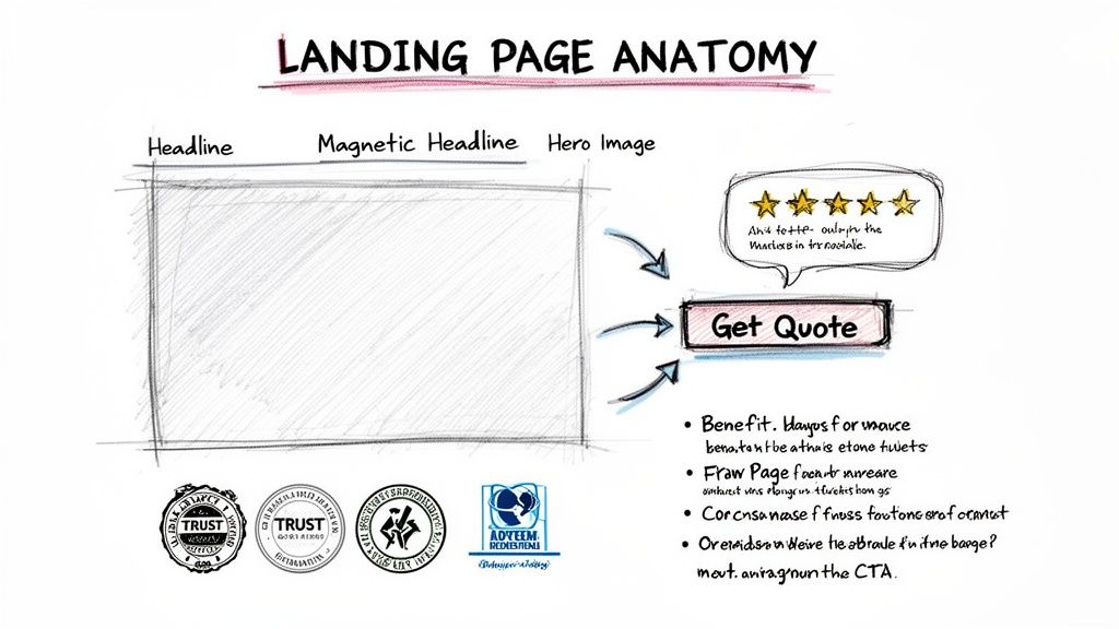
The Magnetic Headline And Subheadline
Your headline is your first impression, and you only get one. Its job is simple: confirm to the visitor that they've landed in exactly the right place. It has to perfectly mirror the promise you made in your Google Ad to create that seamless "message match."
If your ad screams "24/7 Emergency Plumbing Services," your headline had better not whisper "Your Local Plumbing Experts." That mismatch creates instant doubt.
The subheadline is its trusty sidekick. It swoops in to add a bit more context or dangle a key benefit, answering the visitor's very next thought.
- Headline: Fast, Reliable Emergency Plumbing in Denver
- Subheadline: Get a licensed plumber to your door in 60 minutes or less, day or night.
See how that works? The user's click is instantly validated, and they're given a powerful reason to stick around.
A Single, Unmistakable Call-To-Action
This is where so many landing pages fall flat. A truly effective page has one goal, which means it has one call-to-action (CTA). Your goal is for them to either call you or fill out a form—not both. Giving people too many choices leads to "analysis paralysis," and they end up doing nothing at all.
Your CTA button needs to stand out. Use a bold, contrasting color that practically jumps off the page, and fill it with action-oriented text that tells the user exactly what happens next. Ditch the lazy "Submit" button.
Try something more compelling, like:
- Get Your Free Quote Now
- Schedule My Consultation
- Download the Guide
This kind of clarity removes all the guesswork and makes the click feel like the obvious next step.
Compelling Visuals That Tell A Story
The "hero shot"—that main image or video at the top of the page—is your emotional hook. It needs to show your product in action or, even better, the positive outcome of using your service. Generic stock photos are the absolute enemy of conversions. They scream "inauthentic" and are invisible to most users.
A great hero shot lets the visitor instantly picture themselves benefiting from your offer. If you're a roofer, show a happy family standing in front of their safe, newly repaired home—not just a boring close-up of shingles.
Trust Signals That Dissolve Doubt
Before anyone hands over their email address or credit card number, they need to feel confident that you're the real deal. Trust signals are the visual proof that you're credible and trustworthy. Sprinkling these throughout your page is one of the fastest ways to lower a visitor's guard.
- Client Logos: If you’ve worked with recognizable companies, show off their logos. It's an instant credibility boost.
- Testimonials and Reviews: Quotes from real, happy customers are pure gold, especially if you can include their name and photo. It's powerful social proof.
- Case Results: For a law firm, nothing beats hard numbers. "Secured a $1.2 million settlement for a client" is infinitely more persuasive than a vague testimonial.
- Security Badges: Taking payments or sensitive info? Displaying trust seals from known security providers isn't optional; it's essential.
For instance, a skincare brand could showcase user-generated photos from Instagram—real people with real results. This feels far more authentic and relatable than a polished studio photo, creating a genuine connection with potential customers. All these elements work in harmony to create a distraction-free path straight to your conversion goal.
Building Your First Landing Page The Right Way
Alright, theory is great, but now it's time to actually build something. Putting together your first landing page can seem daunting, but it really just boils down to making a series of smart, focused choices that nudge your visitors toward taking that one specific action. The right tool and a clear game plan are everything.
Your first decision is what you’ll use to build it. Sure, you could code a page from scratch or try to wrestle with a generic website builder, but for Google Ads campaigns, a dedicated landing page tool is almost always the right call. These platforms are built from the ground up for one thing: conversions. They’re packed with features designed to get you more bang for your ad buck.
Choosing the Right Landing Page Builder
When you’re looking at different tools, it's easy to get sidetracked by pretty templates. Ignore them for a minute. What you really need to focus on are the core features that will directly boost your Google Ads performance. These are the non-negotiables that separate a decent tool from a great one.
Here’s what I always look for:
- Effortless A/B Testing: You need a platform that makes it dead simple to clone a page, tweak one thing (like the headline), and automatically split traffic between the two. This is the heart and soul of optimization.
- Dynamic Text Replacement (DTR): For Google Ads, this is a total game-changer. DTR lets you automatically swap out your landing page headline to match the user's exact search query. Instant message match, zero effort.
- Blazing-Fast Page Speed: Google cares a lot about how fast your page loads. A sluggish landing page will sabotage your Quality Score and drive up your costs before anyone even sees your offer.
A great landing page builder isn't just a design tool; it's a conversion optimization suite. It should empower you to test, learn, and improve your campaigns without needing a developer for every small change.
Structuring Your Page for a Natural Flow
With a tool picked out, it's time to map out the page's structure. Think of your landing page as a short story. You need to guide your visitor’s eyes down the page in a logical order, giving them the right information at the right time.
There's a tried-and-true layout that just works. Start with your most powerful message "above the fold"—that’s everything a visitor sees without having to scroll. This critical space absolutely must have your magnetic headline, a supportive subheadline, a strong visual, and your main call-to-action button. This setup ensures that even someone with a 5-second attention span gets the gist of your offer and knows what to do next.
As they scroll, you can then introduce your supporting arguments: benefit-packed bullet points, social proof like testimonials or client logos, and then a final call-to-action at the bottom. This last CTA is for the people who needed a bit more convincing before they were ready to click.
Writing Copy That Actually Converts
The words on your page have one job: speak directly to your visitor's problem and frame your offer as the perfect solution. This isn't the place for vague promises or corporate fluff. Your copy needs to be sharp, benefit-driven, and clear.
Stop listing features and start translating them into benefits.
- Feature-focused (Weak): "Our software has a 256-bit encryption feature."
- Benefit-focused (Strong): "Keep your client data completely secure and private."
See the difference? That simple shift connects with what the user actually wants. They aren't buying encryption; they're buying peace of mind. Hit their pain points head-on and show them you get it. That's how you build trust and make your offer feel like the only choice.
Finally, you have to design with a mobile-first mindset. The vast majority of Google Ads clicks now come from smartphones, so your page has to look and feel perfect on a small screen. We're talking big, tappable buttons, text that's easy to read, and forms that don't make you want to throw your phone. Always test your page on an actual phone, not just the desktop preview, to make sure the experience is truly seamless.
Scaling Your Results With A/B Testing
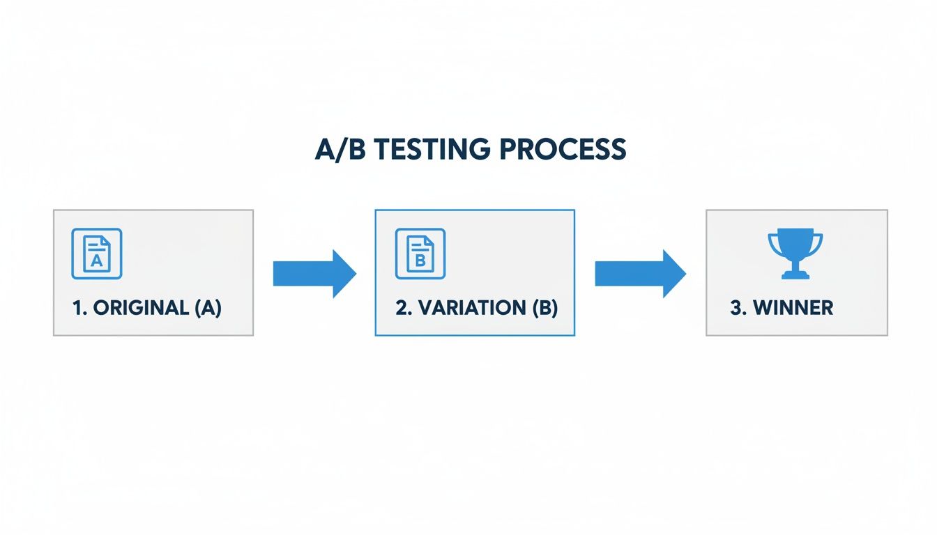
Launching a solid landing page is a great start. But if you want to turn a good Google Ads campaign into a great one, you have to keep optimizing. That’s where A/B testing comes in.
It’s a simple concept: create a slightly different version of your page, split the traffic between the two, and see which one gets more conversions. Relying on guesswork or what you think should work will only take you so far. Testing is the only way to know for sure what actually resonates with your audience.
This isn't about having just one landing page; it's about building a whole portfolio of targeted, high-performing pages. Think of it as moving from a single point of conversion to an entire ecosystem built for performance.
The data backs this up. Businesses with 21 to 40 landing pages see a nearly 300% increase in conversions compared to those with just a handful. It makes sense, then, that 48% of marketers are already building a unique page for every campaign they run. You can dive deeper into these stats over at salesgenie.com.
What Really Moves The Needle In A/B Tests
It’s easy to get lost in the weeds, testing tiny changes like the shade of blue on a button. To see real growth, you need to focus on the elements that have the biggest psychological impact on your visitors.
Here are the heavy hitters I always recommend starting with:
- The Headline: This is your best shot at grabbing attention. Test completely different angles. Try a benefit-driven headline against one that pokes at a major pain point.
- The Call-to-Action (CTA): What you ask people to do matters. Experiment with the button text ("Get a Free Demo" vs. "See Pricing"), the color, and even its placement on the page.
- The Offer Itself: This is a big one. Sometimes, it’s not the page that’s the problem—it’s the offer. Pit a free trial against a downloadable guide and see what your audience really wants.
- Hero Image or Video: The main visual sets the tone. Test a clean product shot against a lifestyle photo of a happy customer. You might be surprised by what connects emotionally.
- Form Length: Every field you ask for adds friction. Try removing just one or two non-essential fields. A long, intimidating form is a notorious conversion killer.
The real goal of A/B testing isn't just to find a "winner." It's to gain deep insights into what actually motivates your customers. You can then apply those learnings across all of your marketing.
A Practical A/B Testing Scenario
Let’s walk through a real-world example. Imagine a software company is running a Google Ads campaign for its project management tool. Their current landing page (Version A) offers a "Free Demo." It’s doing okay, but they have a hunch they can do better.
Their hypothesis? Some visitors aren't ready to commit to a demo and would prefer something with less pressure.
So, they create Version B. It’s an identical page in every way but one: the offer is now a "Free Pricing Guide" download.
- Version A (The Control): The headline reads "Schedule Your Free Demo Today." The CTA button says "Book My Demo."
- Version B (The Variation): The headline is changed to "Download Our Complete Pricing Guide." The CTA button now reads "Get the Guide."
Using their landing page builder, they set up a test to split incoming ad traffic 50/50 between the two pages. They let it run for a couple of weeks to gather enough data for a reliable result.
Making Data-Driven Decisions
After the test period, the results are in.
Version A (the demo) had a conversion rate of 5%. But Version B (the pricing guide) converted at an impressive 12%.
The winner is clear.
Even though the demo leads might be slightly more qualified upfront, the sheer volume of new leads from the pricing guide gives their sales team far more opportunities to work with.
This single test didn't just improve one page; it gave the company a powerful insight. They learned that a large segment of their audience wants to self-educate with low-commitment content before ever speaking to a salesperson. That's a lesson they can now use to shape their future campaigns and content strategy.
For a more detailed walkthrough of this process, check out our guide on how to properly A/B test a landing page. This methodical approach is what turns your landing pages from static brochures into dynamic, ever-improving conversion machines.
7. Get Leads to Your Sales Team Instantly
Getting someone to fill out your form is a huge win, but it's really just the beginning. A fantastic landing page gets the lead, but your follow-up process is what turns that lead into a customer. This is where the magic happens, connecting the dots between your Google Ads click and a real sales conversation.
It all starts with the form itself. Your goal is to make it ridiculously easy for people to say "yes." This means finding that sweet spot—getting the info you need to qualify them without making them feel like they're filling out a tax return. For most of us, that's just a name, email, and phone number.
And don't forget your button copy! "Submit" is boring. It does nothing. Instead, use action-focused text that reminds them what they're getting. Something like "Get My Free Quote" or "Download the Guide Now" gives them a sense of ownership and reinforces the value.
Speed Isn't a Suggestion—It's a Requirement
The moment a user clicks that button, a timer starts, and it ticks fast. A lead's value drops dramatically in minutes, not hours. I've seen it time and again: a lead followed up within five minutes is infinitely more likely to close than one left to sit for even an hour.
If you're still downloading a CSV file of your leads at the end of the day, you're leaving a massive amount of money on the table. It's a recipe for failure in today's market.
By the time your team finally calls, that initial spark of interest is gone. They might have forgotten they even filled out the form, or worse, they've already talked to three of your competitors who were faster on the draw. This is the gap that automation was built to solve.
How to Bridge the Gap from Google Ads to Your CRM
Modern Google Ads campaigns, especially on Search, YouTube, and Discovery, often use lead form extensions. These are brilliant because they capture leads right on the platform, but they can easily become a data black hole if you're not careful.
This is where you need to get smart with automation.
Instead of manually exporting anything, a tool like Pushmylead can instantly zap that lead's information straight from Google Ads into your sales team's email or your CRM.
The second a prospect hits "submit" on your Google ad, an automation fires off. Their details land directly in your sales pipeline, flagged as a hot new lead. This simple change turns a passive data-gathering exercise into an active, high-speed sales engine.
Think about it like A/B testing your landing pages. You run tests to find the winning variation that gets you more leads. But what's the point of getting more leads if you can't handle them properly?
Just as you optimize your pages for conversions, you need to optimize your follow-up process for speed. More leads from a winning page only amplifies the need for instant delivery.
Why You Can't Afford to Do This Manually
Let's be clear: automating lead delivery isn't just a nice-to-have. It's a serious competitive advantage that directly impacts your bottom line.
Consider the difference in efficiency and potential revenue between a manual and an automated process.
Lead Follow-Up Method Comparison
| Metric | Manual Download (Daily) | Automated Forwarding (Instant) |
|---|---|---|
| Lead Response Time | 4-24 hours | < 1 minute |
| Contact Rate | Low | Very High |
| Conversion Potential | Significantly Decreased | Maximized |
| Competitor Risk | High (they respond first) | Low (you're the first call) |
| Sales Team Focus | Admin & Data Entry | Selling & Closing Deals |
The table makes it pretty obvious. Manual follow-up is a relic of the past. It guarantees you're speaking to colder leads and losing deals to faster competitors.
Automating this ensures every single lead—paid for by your hard-earned Google Ads budget—gets the immediate attention it needs. It frees your sales team from tedious admin work and lets them do what they're paid to do: sell.
For a deeper dive into how this fits into a bigger picture, check out these 7 Essential Automations for Business Growth. Building a seamless, automated flow from the first ad click to the final sales call is how you create a true conversion machine.
Answering Your Top Landing Page Questions
Even when you've got a solid plan, a few questions always seem to pop up during the build. I've been there. Getting these details right can be the difference between a campaign that just sputters along and one that really takes off. Let's dig into the questions I hear most often.
How Many Landing Pages Do I Actually Need?
The simple answer? More than one, but don't panic—you don't need hundreds. Sending all your Google Ads traffic to a single landing page is like throwing money away. You wouldn't send someone looking for a specific tool to the front door of a massive department store and hope they find it.
The key is to think in terms of ad groups or keyword themes, not individual keywords.
For example, if you're a plumber, your ads for "emergency leak repair" and "routine drain cleaning" need to point to two completely different pages. The first person is stressed and needs immediate help. The second is planning ahead. Their mindset is totally different, so the page they see should be too.
- A good starting point: Create a unique landing page for each of your top 5-10 ad groups.
- As you grow: Your goal should be to have a dedicated page for any ad group that eats up a significant chunk of your budget.
This strategy nails the message match between your ad and your page. As we've discussed, that's a direct line to a better Quality Score and, more importantly, a lower cost for each click.
Video Backgrounds: Good or Bad for Conversions?
I get this question all the time. While a slick video background looks cool, for traffic coming from Google Ads, they almost always hurt more than they help.
The biggest problem is page speed. Video files are huge, and they can absolutely cripple your load time, especially on mobile—which is where a massive portion of your Google Ads traffic comes from. We're talking about a delay of just a couple of seconds, but that's an eternity for an impatient user who will just hit the back button.
Stick with a crisp, optimized hero image. Unless your product is so visual that a video is the only way to explain it, speed and clarity will beat flashy design every single time.
What’s the Perfect Length for a Lead Form?
Keep it as short as humanly possible, but no shorter. Your goal is to get the absolute minimum information your sales team needs to actually follow up and qualify the lead.
Every single field you add is another little hurdle. Another reason for someone to say, "Nah, not worth it," and leave.
Here’s how I approach it:
- Start with the essentials: Name, Email, and Phone Number. For many businesses, this is all you really need to get the ball rolling.
- Add fields only if they are deal-breakers: If your team literally cannot have a conversation without knowing the company size or project budget, then fine, add it. But be honest with yourself.
- Challenge every single field: Do you really need their full mailing address right now? Can you find out their job title on the follow-up call?
For most campaigns I've run, the magic number is somewhere between 3 and 5 fields. This gives the sales team enough to work with without scaring off the prospect. Remember, the landing page's job is to start the conversation, not close the deal.
Getting your landing page to convert is a huge win, but the job isn't done. You need to get those fresh leads to your sales team instantly. Pushmylead handles this perfectly by automatically sending leads from your forms straight to your email or CRM. No more manual downloads, no more delays. Check out how it works at Pushmylead's official website.