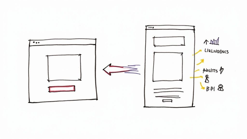
Let's get straight to it. A high-converting landing page isn't just another page on your website. It's a purpose-built, standalone page designed with one job and one job only: to turn a visitor from your Google Ads campaign into a lead or a customer.
It does this by making a clear, compelling offer that perfectly mirrors the promise made in the ad that brought them there. This connection is absolutely vital. A strong landing page experience is a major factor in Google's Quality Score calculation, which directly impacts your ad rank and how much you pay per click.
Aligning Your Google Ad and Landing Page for Maximum Impact
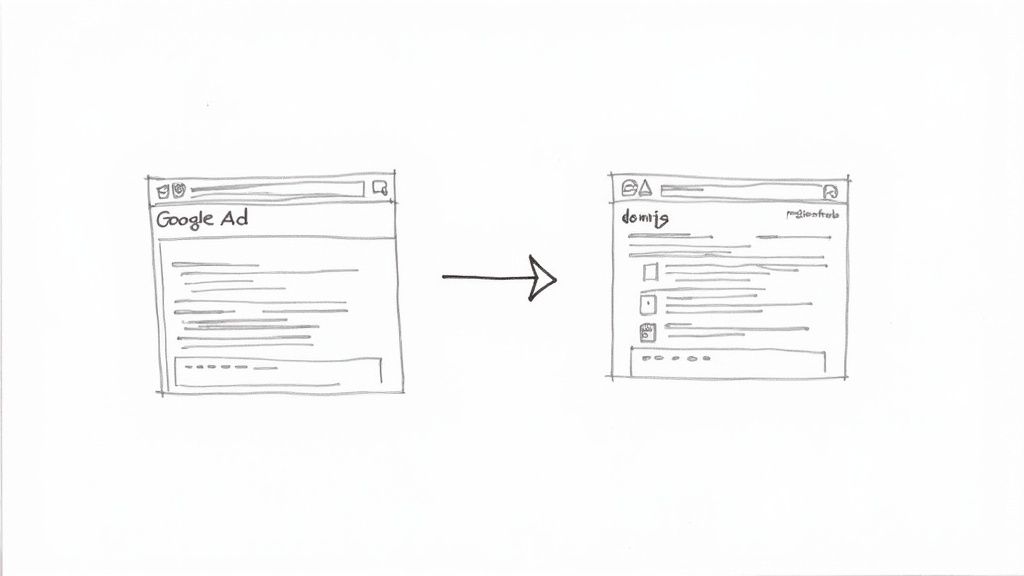
One of the quickest ways to burn through your ad budget is to have a major disconnect between your ad and your landing page. Think about it from the user's perspective. They click an ad promising "50% Off Custom Kitchen Cabinets," only to be dumped on a generic homepage. It’s jarring. It’s confusing. And it’s a recipe for a quick exit and a wasted click.
This seamless transition from ad click to page content is what we call message match, and it's a pillar of the Google Ads ecosystem.
Getting the message match right is the bedrock of a landing page that actually converts. It immediately tells the user, "Yep, you're in the right place." This builds instant trust and improves your Landing Page Experience score within Google Ads. A poor score not only kills conversions but signals to Google that your page isn't relevant, leading to a lower Quality Score and higher ad costs.
Understanding User Intent Before You Build
Take a hard look at the keywords in your Google Ads campaign. Someone searching for "emergency plumber near me" has high commercial intent and needs a phone number and a “Call Now” button immediately. Someone searching "how to fix a leaky faucet" has informational intent and is just looking for a guide.
Your landing page has to speak directly to the intent behind the search query. If your ad targets keywords with commercial intent, the page needs to be built to convert, not just to inform. Of course, getting the right people to your page in the first place is half the battle. To make sure you’re driving quality traffic, it’s worth brushing up on the fundamentals of winning with PPC ads on Google.
To really nail this, you need to ensure every key part of your ad is reflected on your landing page. Let's break down exactly what that looks like.
Core Elements for Strong Message Match
This checklist will help you ensure your Google Ad and landing page are perfectly aligned, creating a seamless journey that Google's algorithm—and your users—will reward.
| Element | Objective | Why It Matters for Conversions & Quality Score |
|---|---|---|
| Headline | Grab attention and confirm the user is in the right place. | The headline should echo the ad's main promise. A strong match reduces bounce rates instantly. |
| Key Offer / Value Prop | Clearly state the benefit or discount from the ad. | If the ad says "50% Off," the landing page needs to scream "50% Off" right at the top. |
| Visuals (Images/Video) | Reinforce the ad's message and show the product/service. | Consistent imagery builds trust and helps the user visualize the solution they're getting. |
| Call-to-Action (CTA) | Tell the user exactly what to do next. | The CTA button text should align with the ad's goal (e.g., "Get a Free Quote," "Download Now"). |
| Keywords | Use the same core keywords from your ad group. | This not only reassures the user but also improves your Google Ads Quality Score. |
By checking these boxes, you're not just creating a landing page; you're building a cohesive and persuasive experience that guides the user straight to conversion.
The Power of a Single Conversion Goal
Ever heard the saying, "A confused mind says no"? It's gospel in landing page design.
The most successful landing pages are built around a single, specific conversion action. Don't ask visitors to fill out a form, download a guide, and watch a video all at once. Pick the one action that matters most to your Google Ads campaign goal and strip away everything else.
This laser-focused approach eliminates distractions. In fact, studies consistently show that landing pages with one clear offer and a single call to action perform best, sometimes hitting conversion rates around 13.5% or higher, easily outpacing pages cluttered with multiple offers.
This is especially true for lead generation. Whether you’re embedding a form on the page or using Google Ads Lead Form Extensions, the goal is the same: get their info with the least amount of friction. If you're focused on capturing leads right from the search results page, our guide on how to use them dives deep into that specific tactic.
The golden rule is simple: Every element on your landing page—from the headline and images to the body copy and CTA button—should work together to persuade the visitor to complete that one, single action.
Designing a Layout That Guides User Action
A beautiful design that doesn’t lead to a conversion is just a pretty picture. When it comes to landing pages for Google Ads, we're not aiming for an art award; we're building a machine designed for one thing: getting that conversion.
The secret is a strong visual hierarchy. Think of your page as a path you want the user to follow. Every single element, from text size to color choice, should act as a signpost, pointing them from the headline directly to your call-to-action (CTA).
Your most important message—the headline—needs to be the biggest and boldest thing they see. Right after that, their eyes should land on your CTA button, which should pop with a contrasting color. Everything else is just supporting cast. This isn't about limiting creativity; it's about creating a clear, intentional journey for the visitor.
Nailing the Above the Fold Experience
What a visitor sees the moment your page loads—before they even think about scrolling—is called "above the fold." You have roughly three seconds to make it crystal clear they’ve landed in the right spot. If this first impression doesn't match the promise of the ad they just clicked, they're gone.
This critical space absolutely must include three things:
- A Clear Headline: It should feel like a direct continuation of your ad copy.
- A Supporting Subheadline: Quickly add a bit more detail or highlight a key benefit.
- Your Call-to-Action (CTA): The button should be right there, no scrolling required.
This isn't just a best practice; it's the handshake that tells the user, "Yes, you're where you need to be. Here's what to do next."
The Power of Visuals and White Space
Images and videos aren't just filler content. They need to work for you. Use high-quality visuals that are directly tied to what you're offering. If you’re a consultant, a professional headshot or a photo of you with a client works wonders. Selling a physical product? Show it being used in a real-world scenario.
Just as important is what you leave out. White space—the empty area around your text and images—is one of the most powerful design tools you have. It gives your content room to breathe, making your page feel less intimidating and much easier to read. A cluttered page screams chaos; a clean layout feels calm and guides the eye right where you want it to go.
Effective conversion starts with a well-planned layout. To go deeper on the fundamentals, it's helpful to see examples of how to design a landing page that guides visitors naturally.
Ultimately, your layout's job is to create a smooth, frictionless path to conversion. By focusing on a clear visual hierarchy, a killer above-the-fold section, and the strategic use of visuals and white space, you create an environment that encourages people to take action. You’re not just throwing information at them; you’re building a purposeful experience that turns expensive Google Ads clicks into real, valuable leads.
Writing Compelling Copy That Converts Clicks to Leads
So, your ad did its job and got the click. Great. But now comes the hard part: getting the conversion. The words on your landing page are what make or break the entire campaign.
Writing for a Google Ads audience isn't like writing for your homepage. These people are on a mission. They have a problem, and they're actively searching for the solution right now. Your copy needs to convince them, and fast, that you're it. It all starts with the headline.
Think about it: if your ad promised "Emergency Plumbing Repair," your landing page headline can't be a generic "Welcome to Johnson & Sons Plumbing." It needs to instantly deliver on that promise. Something like, "Fast, 24/7 Emergency Plumbing Repair When You Need It Most" immediately tells the visitor they’re in the right place. That split-second confirmation is a cornerstone of a converting landing page.
Answering "What's in It for Me?"
Once you’ve hooked them with the headline, the rest of your copy has one primary job: to answer the visitor's unspoken question, "What's in it for me?"
This is not the time to ramble on about your company's long and storied history. People don't care. They care about their problems. Use clear, scannable bullet points that get straight to the value you offer.
- Focus on Outcomes, Not Features: Don't just say, "We use titanium-grade pipes." Instead, frame it as a benefit: "Get Pipes Guaranteed to Last for 25 Years." See the difference?
- Solve Their Pain Points: You're not just listing services; you're solving problems. A plumber could say, "Stop Worrying About Leaks With Our Proactive Inspections."
- Use Simple Language: Ditch the industry jargon. Talk like a real person, using words your customers actually understand and use every day.
This simple shift in perspective turns your copy from a boring description into a powerful reason why they should choose you over the competition.
Building Trust with Social Proof
Let's be honest—skepticism is the biggest conversion killer out there. The person who just clicked your ad doesn't know you from Adam. You have to build credibility, and you have to do it quickly.
This is where social proof becomes your best friend. It’s the digital version of a word-of-mouth recommendation, and it's incredibly effective.
Try placing testimonials, trust seals (like a Better Business Bureau logo), or snippets from case studies right next to your call-to-action. These little trust signals are powerful validators. They calm a visitor’s anxieties and show that other real people have trusted you and had a great experience. It's no surprise that 37% of leading local landing pages feature customer testimonials for this very reason.
Crafting an Irresistible Call-to-Action
Every single word on your landing page should be nudging the visitor toward one thing: your call-to-action (CTA). Your CTA isn’t just a button; it’s the final, critical instruction telling the user exactly what to do next.
Vague, lazy CTAs like "Submit" or "Click Here" are pure conversion poison. Don't use them.
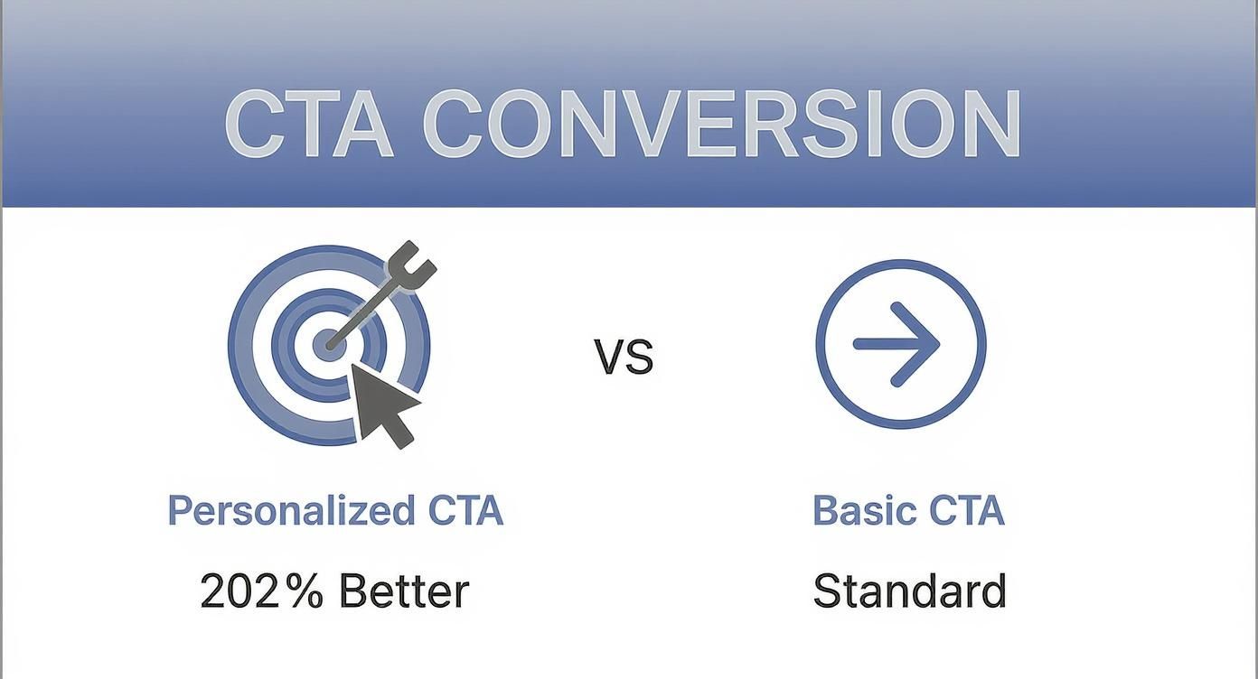
Instead, your CTA needs to be specific, action-oriented, and highlight a benefit. Try phrases like "Get Your Free Quote Now" or "Download My Free Guide." It’s also wildly effective to personalize them. In fact, research shows that personalized CTAs convert 202% better than generic ones. If you want to dive deeper, you can discover more insights about landing page statistics on sellerscommerce.com.
The job of your CTA is to erase any last-minute hesitation. Make it clear, compelling, and impossible to miss. It's the final handshake that turns a curious click into a valuable lead for your business.
Don't Let a Slow Page Kill Your Mobile Conversions
Let's be blunt: a slow landing page is the silent killer of Google Ads campaigns. We live in an "I want it now" world, and every millisecond your page takes to load is a chance for a potential lead to bounce. A delay of just a few seconds can send your conversion rates into a nosedive and jack up your cost per click.
This is especially true on mobile, where the majority of your ad clicks are probably coming from. Your mission, should you choose to accept it, is to make your landing page feel instantaneous.
How do you do that? It starts with the technical basics. Compress your images until they’re lean but still look good. Minify your CSS and JavaScript files to cut out the fluff. And definitely use browser caching to give repeat visitors a VIP, near-instant loading experience.
These aren't just "nice-to-haves." These are the core actions that will boost your score in tools like Google's PageSpeed Insights and, more importantly, keep impatient visitors from leaving.
A high performance score in PageSpeed Insights isn't just for bragging rights. It's a direct reflection of a better user experience, which can give your Google Ads Quality Score a much-needed lift.
Start with a Mobile-First Mindset
Thinking "mobile-first" isn't a trend anymore; it's the only way to build a landing page that actually converts. This means you design the mobile experience first, then scale it up for desktop—not the other way around.
On a small screen, everything is about usability. Picture someone holding their phone, probably with one hand, maybe while waiting in line for coffee.
- Thumb-Friendly Buttons: Your call-to-action buttons need to be big and bold. Make them easy for a thumb to tap without accidentally hitting another link.
- Legible Text: Use a clean, simple font. Make sure the size and spacing are generous enough that no one has to pinch and zoom to read your message.
- Painless Forms: Keep your forms brutally short. Only ask for the absolute bare minimum you need to qualify a lead. Every extra field is another reason for them to give up.
The bottom line is that a mobile user is often distracted and has zero patience for a clunky experience. Your design has to be clean, focused, and dead simple to use. Any friction at all, and they're gone.
The numbers on this are staggering. Research shows that landing pages loading in under one second can see a 31.79% conversion rate. But if that load time drags to five seconds? The rate plummets to just 9.68%. You can dig into the full research on landing page conversion rates to see just how much speed impacts your bottom line.
Mobile vs Desktop Design Priorities
Optimizing for different devices means prioritizing different elements. What works on a wide desktop screen is often a disaster on a narrow mobile view. Here’s a quick breakdown of where your focus should be for each.
| Consideration | Mobile-First Approach | Desktop Approach |
|---|---|---|
| Navigation | Simple, collapsed menus (like a hamburger menu). Prioritize vertical scrolling. | Visible, full navigation bars. Can accommodate more complex layouts. |
| Layout | Single-column, linear design. Stack elements vertically for easy scrolling. | Multi-column layouts are acceptable. More complex grids and visuals. |
| CTAs | Large, "thumb-friendly" buttons. Often "sticky" at the top or bottom of the screen. | Can use more subtle buttons and text links. Placed within content flow. |
| Forms | Minimal fields. Use single-tap inputs and auto-fill where possible. | Can support longer, more detailed forms if necessary. |
| Visuals | Highly optimized, compressed images. Use fewer, high-impact visuals. | Higher resolution images and video are more common and acceptable. |
Thinking through these priorities from the start ensures that you’re not just shrinking a desktop page, but truly building an experience designed for the device your visitor is using.
Don't Forget to Track Mobile Performance
All this optimization work is useless if you're not tracking the results properly. You have to be absolutely sure your conversion tracking is dialed in for mobile users.
That means grabbing your phone (and maybe a friend's) and testing everything. Do your forms work? Do click-to-call buttons actually initiate a call? Make sure every single lead is being captured.
This data is gold because it feeds right back into your Google Ads campaigns. It tells the algorithm which users are most likely to convert, allowing it to fine-tune your targeting over time. A fast, mobile-friendly page with perfect tracking creates a powerful feedback loop that consistently drives better results.
Testing Your Way to a Higher Conversion Rate
Let's be honest: your first draft of a landing page is never the final one. Think of it as the starting line, not the finish. The real secret to a landing page that actually converts isn't some magic formula you apply on day one. It's about a commitment to constant, data-backed improvement.
This is where A/B testing comes in. It sounds technical, but it’s really just a way of letting your audience vote with their clicks. You're taking the guesswork out of the equation and replacing your gut feelings with cold, hard data. Instead of thinking a new headline might perform better, you test it and know for sure.
Every good test starts with a clear hypothesis—an educated guess about what change will get you a better result. For example, you might hypothesize: "Changing the button text from 'Submit' to 'Get My Free Quote' will boost form fills because it tells the user exactly what they're getting."
What to Test for the Biggest Impact
You can test nearly everything on a page, but let's be real—your time is limited. So, where do you start? Focus on the elements that have the potential to make the biggest difference. Don't waste your energy testing 50 shades of blue on a hyperlink.
Instead, start with the heavy hitters:
- The Headline: This is your best (and sometimes only) shot to grab someone's attention. Try testing completely different angles. For instance, pit a headline focused on a pain point against one that highlights a major benefit.
- The Hero Image or Video: Your main visual sets the entire mood. Test a clean product shot against a photo of a real person using that product. You might be surprised by what resonates more.
- The Call-to-Action (CTA): This is a huge one. Test the button text, the color, and even where you place it on the page. Tiny tweaks here can lead to surprisingly big wins.
- Form Length: A classic for a reason. Will you get more leads by asking for just an email versus an email and a phone number? Almost always, the answer is yes, but testing will tell you how much of a difference it makes.
The point of testing isn't just to find a "winner." It's to learn. Every test—win or lose—teaches you something valuable about what makes your audience tick. That knowledge is what separates the good advertisers from the great ones.
Making Decisions with Data, Not Gut Feelings
Once you've got your hypothesis and picked an element to test, you'll need a tool to run the experiment. While Google Optimize has been sunset, many other A/B testing platforms can do the job. These tools automatically split your traffic from Google Ads, showing half your visitors Version A (the original) and the other half Version B (your variation).
From there, the platform tracks which version brings in more conversions. The key is to be patient and wait for statistical significance. This is just a fancy term that confirms your results aren't a random fluke. Most tools will tell you when you've hit a high enough confidence level—usually 95% or higher—to officially declare a winner.
This is how you truly optimize a campaign. Small, iterative wins from ongoing testing start to stack up. A 10% lift this month, followed by another 15% lift next month, can completely transform your return on ad spend and turn a so-so campaign into a seriously profitable one.
Got Questions? We've Got Answers
Even the most seasoned pros run into questions when building out a landing page for a new Google Ads campaign. Let's tackle some of the most common ones that pop up.
So, How Long Should My Landing Page Actually Be?
The classic (and most truthful) answer is: as long as it needs to be, and not a word longer. Think about what you're asking someone to do. If it’s a simple, low-commitment offer like downloading a free e-book, a short, punchy page is all you need. Get straight to the point.
But if you're selling a high-ticket consulting service or a complex piece of software, you've got more work to do. You’ll need more space to build trust, handle objections, and thoroughly explain the value. The goal is to match the page length to the "ask." Always choose clarity over brevity or fluff.
How Many Fields Should I Put on My Form?
As few as you can possibly get away with. Seriously. Every single field you add is another little hurdle for your visitor, and another reason for them to just close the tab.
Start with the bare minimum. For most lead-gen campaigns, that’s just a name and an email.
My rule of thumb is this: if you can't clearly explain why you need that piece of information right now, don't ask for it. You can always gather more intel later in the sales process after you've made that initial connection.
What’s a “Good” Conversion Rate for a Landing Page?
This is the million-dollar question, and the answer varies wildly. It depends on your industry, your traffic source, your offer… everything. But if you need a general benchmark, most people aim for something in the 2% to 5% range. In some niches, the top-tier pages can hit 10% or more, but don't let that be your only measure of success.
Instead of chasing an arbitrary number, focus on your own baseline. The real goal is to consistently beat your own current conversion rate. That's what testing and optimization are all about.
Can I Just Use the Same Landing Page for Different Ad Groups?
I’d strongly advise against it. The magic of a high-performing landing page is its direct connection to the ad that sent the visitor there. This is called message match, and it's crucial for your Quality Score.
Think about it. If someone clicks an ad for "emergency plumbing services," they expect to land on a page that screams "we solve your emergency plumbing problem right now!" Sending them to a generic "Our Plumbing Services" page dilutes that urgency and relevance.
It takes more work, but creating dedicated, tightly-themed landing pages for each ad group almost always pays off with better conversion rates and a higher Quality Score.
Ready to stop wasting time downloading CSVs and start talking to your leads instantly? Pushmylead sends your Google Ads lead form data straight to your email the second it comes in. See how Pushmylead can get your leads to you faster.