When someone clicks your Google Ad, the very first thing they experience is your landing page. That initial impression is everything. It has to instantly deliver on the promise your ad made, creating a seamless connection that tells the visitor, "Yes, you're in the right place." We call this message match, and it’s the bedrock of any successful Google Ads campaign.
Matching Your Ad Promise With On-Page Reality
Think about it from the user's perspective. Your Google Ads campaign doesn't start on the landing page; it begins with the ad copy they just read. That ad sets a very specific expectation.
Let's say someone frantically searches for "emergency plumbing services" and clicks your ad promising "24/7 Emergency Plumbers." They expect to land on a page that screams "emergency plumbing." If they're instead dropped onto a generic homepage that talks about kitchen remodels and new installations, you've created a jarring disconnect. That moment of friction is usually all it takes for them to hit the back button.
Not only have you just wasted your ad spend, but you've also sent a negative signal to Google that your page wasn't relevant to that search. This directly impacts your Landing Page Experience score, a key component of Quality Score.
The Power of Message Match
Message match is simply the art of making sure your landing page directly reflects the keywords and ad copy that brought the visitor to you. It's not just a nice-to-have; it's a critical component that directly impacts your campaign's bottom line.
A strong message match makes the user's journey feel effortless and intuitive. Google sees this and rewards you for it by improving your Google Ads Quality Score.
A higher Quality Score is more than just a pat on the back. It directly translates to a lower cost-per-click (CPC) and better ad positions. In other words, you pay less than your competitors for a more prominent spot on the search results page. It's Google's way of rewarding advertisers who provide a fantastic user experience.
Why Dedicated Landing Pages Win Every Time
This is precisely why dedicated landing pages are non-negotiable for serious Google Ads campaigns. They are built for one thing and one thing only: to convert a visitor. Unlike a homepage or a blog post designed for browsing and exploration, a landing page for conversion is a focused, persuasive workhorse.
The data doesn't lie. When it comes to generating leads, dedicated landing pages are in a league of their own.
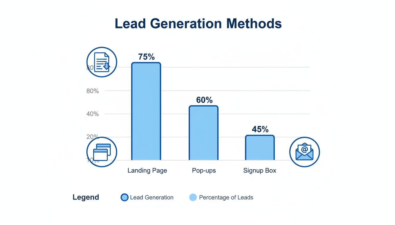
The numbers paint a clear picture. While other tools have their place, a focused landing page is far and away the most effective way to turn clicks into actual leads.
To really drive this point home, let's look at a direct comparison of how different methods perform.
Conversion Method Effectiveness Comparison
This table illustrates the stark difference in average conversion rates between dedicated landing pages and other common lead capture methods, highlighting why a focused page is essential for Google Ads success.
| Conversion Method | Average Conversion Rate | Effectiveness vs. Signup Box |
|---|---|---|
| Landing Page | 6.6% | 1000% Better |
| "Wheel of Fortune" Form | 2.9% | 383% Better |
| Pop-up Form | 0.9% | 50% Better |
| Basic Signup Box | 0.6% | Baseline |
As you can see, the average landing page conversion rate of 6.6% is a staggering 1000% higher than a basic signup box. This isn't a small difference; it's the kind of performance gap that can make or break a campaign's profitability.
For a deeper dive into the principles that drive these results, check out these 10 essential landing page best practices. They cover the key elements you need to get right.
Writing Copy and CTAs That Drive Action
The moment someone clicks your ad and lands on your page, a timer starts. You have just a few seconds to convince them they’re in the right place. Your copy is your digital salesperson, and it needs to work fast. It must immediately connect with their problem and frame your offer as the perfect solution.
This all starts with a headline that mirrors what they just typed into Google. If your ad targets "affordable lawn care services," your headline can't be some vague promise like "Your Premier Landscaping Partner." It needs to be direct: "Affordable Lawn Care Starting at Just $49/Month."
That simple alignment creates a seamless journey from their search to your solution. It’s the first crucial step in building a high-performing landing page for conversion.
Crafting Headlines and Subheadings That Convert
Think of your headline as the gatekeeper. It has one job: get the visitor to read the next line. If it fails, nothing else on the page matters. It needs to be clear, benefit-driven, and straight to the point.
Your subheadings then pick up the baton, breaking down your offer into bite-sized benefits. And this is a critical distinction: you need to talk about benefits, not features. A feature is what your service does ("weekly mowing"), but a benefit is what the customer gets ("Enjoy a perfect, hassle-free lawn all summer").
Here’s a quick before-and-after:
- Before (Feature-focused): We use industry-leading CRM software.
- After (Benefit-focused): Never lose another lead with our automated tracking system.
See the difference? The second one hits a real pain point—losing leads—and presents a tangible outcome. It speaks directly to what the user wants to achieve.
The best landing page copy makes the visitor the hero. Your product is just the tool they use to conquer their challenge. Frame every sentence around what they will gain.
Making Your Copy Clear and Scannable
Let's be honest: people don't read websites. They scan them. A giant wall of text is the fastest way to get someone to hit the back button.
You have to make your copy incredibly easy to digest. Use short paragraphs, break up lists with bullet points, and bold key phrases that you want to pop.
Ditch the corporate jargon. The goal is to communicate value as simply as possible. In fact, research shows that pages written at a 5th to 7th grade reading level have a median conversion rate of 11.1%. That number drops as the language gets more complex. You can dig into the landing page stats on readability for yourself.
The takeaway is simple: clarity converts. Use simple words and a conversational tone.
Designing a Compelling Call to Action
Your call-to-action (CTA) is the grand finale. It’s the final instruction you give your visitor, and if it's weak or confusing, all your great copy goes to waste.
A truly effective CTA has a few key ingredients:
- Action-Oriented Text: Always start with a verb. Instead of a passive word like "Submit," try "Get Your Free Quote" or "Download My Guide." The text should tell them exactly what happens next.
- Contrasting Color: Your CTA button has to stand out. Pick a color that contrasts with the background and makes it impossible to miss.
- Smart Placement: Put a CTA "above the fold" so it’s visible immediately. For longer pages, it’s a good idea to repeat it further down.
Let's say you're promoting a free marketing webinar. Which CTAs are more likely to get the click?
| CTA Text (Weak) | CTA Text (Strong) |
|---|---|
| Register | Save My Spot Now |
| Click Here | Reserve My Free Seat |
| Learn More | Watch the Webinar |
The stronger versions create a sense of ownership ("My Spot") and urgency ("Now"). These little tweaks in wording can make a huge difference in your click-through rates.
Creating a Smooth Path to Conversion
You could have the best sales copy in the world, but if your page is a confusing mess, it won't matter. The whole point of your design is to make it incredibly easy for someone to see your offer and take action. You're building a path of least resistance from their first click to that final conversion.
This all starts with a strong visual hierarchy. Think of it as a roadmap for your visitor's eyes. Your most important elements—the headline, the main benefit, and that all-important CTA button—need to stand out immediately. Use size, color, and plenty of white space to make them pop. A visitor should get the gist of your offer in just a few seconds.
Get Rid of Distractions (Especially the Navigation Bar)
One of the single most powerful things you can do for a landing page for conversion is also one of the simplest: ditch your main website navigation menu. Your standard header with links to "About Us," "Services," or "Contact" is just a bunch of exit doors.
Remember, you paid for this click. The last thing you want is for that person to get distracted and wander off. By removing the navigation, you create a laser-focused experience where the only real path forward is the one you want them to take.
I've seen this one change boost conversions by as much as 100%. It’s the ultimate "less is more" strategy, forcing visitors to engage with the offer right in front of them instead of clicking away.
Your Form: The Final Hurdle
The form is where it all comes together. This is the moment a visitor turns into a real lead. It's also where most people bail.
The golden rule? Only ask for what you absolutely need, right now. Every single field you add is another little reason for someone to give up. In fact, just dropping the number of fields from four to three can lift conversions by nearly 50%.
- Simple offer (like an ebook): Name and email. That's it.
- High-value offer (like a B2B demo): It’s fair to ask for more, like company name or job title, but be intentional about it.
- A quick tip: Don't ask for a phone number unless you have a process to call them immediately. It's a high-friction field that kills trust if it feels unnecessary.
Using Multi-Step Forms for More Complex Asks
So, what do you do when you genuinely need more info to qualify a lead? Don't hit them with a giant form with ten fields—that’s just intimidating.
Instead, break it up into a multi-step form. This feels way less overwhelming and taps into a bit of psychology. Once someone completes an easy first step (like entering their name), they feel invested and are far more likely to finish the rest.
Here’s how it might look:
- Step 1: "What's your name and email?" (Super easy, low commitment)
- Step 2: "Great! Now, tell us about your company." (They're already in, so this feels natural)
- Step 3: "Last question: what's your biggest challenge?" (The final piece of the puzzle)
This turns an interrogation into a conversation.
Beyond that, make life easier for them. Enable browser autofill and give them clear, real-time error messages. If someone messes up their email address, the form should flag it instantly, not after they hit "submit." Every ounce of friction you remove at this final stage directly translates into more leads from your Google Ads campaigns.
Nailing the Technical and Tracking Foundation
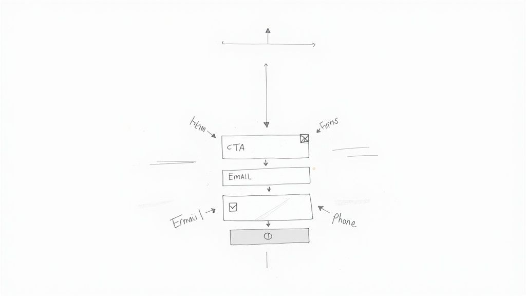
Let's get one thing straight: a slow, buggy page with busted tracking is the fastest way to torch your ad budget. You could have the most persuasive copy and a beautiful design, but if the technical foundation is shaky, you're dead in the water. This is the invisible engine of your landing page for conversion, and if it's not humming, nothing else matters.
Your page's speed is a massive deal. A visitor who clicks your ad and is met with a loading spinner is a visitor who's about to hit the "back" button. Research shows that conversion rates can plummet by over 4.42% for every single second of load time.
This isn't just about making users happy; it's about making Google happy, too. Fast pages are rewarded with a higher Quality Score, which directly lowers your cost-per-click. A slow page is like willingly paying a penalty on every click.
First Things First: Obsess Over Page Speed
Making your page load lightning-fast doesn't require a computer science degree. The big idea is to make it as lightweight as possible. I always start by tackling these three areas first.
- Image Compression: Giant, unoptimized images are the #1 culprit of slow pages. I've seen it a hundred times. Use a tool like TinyPNG or Squoosh to shrink those file sizes way down without making them look pixelated.
- Keep It Simple: Every slick animation, custom font, or third-party script adds weight and slows things down. A clean, simple design almost always performs better, both for speed and for getting people to convert.
- Don't Skimp on Hosting: A cheap, shared server can throttle your site's speed before you even get started. It's a false economy. Invest in a decent hosting provider.
Think of it like packing for a hike. The less junk you carry, the faster you'll get to the destination. Strip out everything that isn't absolutely critical to getting that conversion.
If You Don’t Track It, You Can’t Improve It
Running Google Ads without conversion tracking is just gambling. You're flying completely blind. Accurate tracking is the only way you’ll ever know what’s actually working, calculate your return on ad spend (ROAS), and make smart decisions. This part is non-negotiable.
It all starts with installing the Google Tag (gtag.js) on your landing page. This little snippet of code is the central nervous system for your tracking, letting you send data to both Google Ads and Google Analytics.
Once the tag is on your page, you have to tell it what to look for. That's where conversion actions come in.
Your conversion data is the single most valuable asset in your Google Ads account. Without it, you can't use powerful automated bidding strategies that need those signals to find you more customers. Accurate tracking isn't just for reports; it drives performance.
Setting Up Your Conversion Actions
You need to define what a "conversion" actually is for your business. For a lead generation page, it’s almost always a form submission. While there are a few ways to do this, I find the most reliable method is to route everything through Google Analytics 4 (GA4).
Here's how it works:
- Create an Event in GA4: First, set up an event in GA4 that fires only when someone successfully submits your form. You can often do this right in the GA4 interface with the "form_submit" trigger, or for more control, use Google Tag Manager to create a custom event.
- Flip the "Conversion" Switch: Inside your GA4 property, navigate to the "Conversions" section and simply toggle your new form submission event "on" to mark it as a conversion.
- Import It into Google Ads: Finally, make sure your Google Ads and GA4 accounts are linked. Then, in your Google Ads conversion settings, you can import the GA4 conversion event you just created.
With this setup, every time a lead fills out your form, GA4 catches it, and that signal is passed straight to Google Ads. Your campaign reports will finally show you exactly which ads and keywords are making the phone ring, letting you double down on what truly works.
Using A/B Testing to Find Your Winners
Your first landing page is never your final one. Think of it as your best educated guess—a starting point, not a finish line. Real, sustainable growth in conversions doesn't come from a perfect launch. It's built through a relentless cycle of testing, learning, and iterating. This is where A/B testing (or split testing) becomes your most valuable ally.
The idea is straightforward: you create two versions of your page, an "A" version (the control) and a "B" version (the variation). You then show each version to different segments of your Google Ads traffic and track which one performs better. By changing just one thing at a time, you can prove scientifically what actually moves the needle. It’s all about swapping guesswork for data and letting your audience show you what truly persuades them.
Forming a Strong Hypothesis
Every good test begins with a solid hypothesis, not a random whim. Don’t just test a blue button against a green one because you feel like it. Instead, ground your hypothesis in real data or observed user behavior.
For instance, maybe your heatmaps show that people are bailing before they ever scroll down to your glowing testimonials. That's an insight. From there, you can form a hypothesis: "Moving the social proof section higher up the page will build trust earlier, leading to more form submissions because visitors will see validation right away."
That "because" part is critical. It forces you to think through the why behind the change, elevating a simple guess into a strategic experiment. The goal is to create a feedback loop where the learnings from one test directly inform the hypothesis for the next.
A/B testing isn't about chasing a single "perfect" page. It's about building a culture of continuous improvement. Every test—win or lose—is a lesson that makes your marketing smarter.
To see how testing fits into the bigger picture, many marketers use broader resources to guide their strategy. For example, this detailed landing page conversion rate optimization guide covers comprehensive methods, including how to use A/B testing to discover your winning variations.
Prioritizing Your Tests for Maximum Impact
You can test just about anything on your landing page, but not all tests are created equal. Some changes have the potential to deliver a massive lift in conversions, while others will barely make a dent. You want to start with the big swings—the elements that most directly influence a user's decision.
For anyone just starting out, we've put together a detailed guide on how to A/B test a landing page that walks you through the entire process. As a general rule, you should always prioritize your tests based on their potential impact.
I've put together a quick checklist to help you decide what's worth testing first on your landing page for conversion. Think of this as your roadmap to getting the biggest wins, fastest.
A/B Testing Priority Checklist
| Priority Level | Element to Test | Example Hypothesis |
|---|---|---|
| High | Headline | "Changing the headline from feature-focused to benefit-focused will increase conversions because it will resonate more with the user's core problem." |
| High | Call to Action (CTA) | "Using a more specific CTA button text like 'Get My Free Quote' instead of 'Submit' will increase clicks because it clarifies the value exchange." |
| Medium | Hero Image/Video | "Replacing the generic stock photo with an image of a real customer using our product will build more trust and increase sign-ups." |
| Medium | Form Length | "Removing the 'phone number' field will reduce friction and increase form completions because users are hesitant to share that information." |
| Low | Button Color | "Changing the button color to a higher-contrast shade will make it more visible and lead to a minor increase in clicks." |
Start with the high-priority items like your headline and CTA. These are your heavy hitters and often deliver the most significant results.
Analyzing Your Results and Taking Action
Once your test has run long enough to gather a reliable amount of data (this is known as reaching statistical significance), it's time to dig into the results. Your testing tool will declare a winner, but your job is to figure out why.
Did the benefit-driven headline come out on top? Fantastic. That’s a clear signal that your audience cares more about outcomes than features. Now, you can apply that insight across your other ads and marketing materials. Did the shorter form win? That confirms your audience is looking for a fast, frictionless experience.
Every test result—whether it’s a big win, a surprising loss, or even inconclusive—is another piece of the customer puzzle. Use these insights to constantly refine your understanding of your audience, and let that knowledge fuel your next great idea.
Connecting Conversions to Your Sales Process
Getting a conversion notification from your Google Ads campaign feels great, but that's just the starting whistle, not the finish line. The tough reality is that a lead from a paid ad has an incredibly short shelf life. Its value plummets with every minute that ticks by before your team makes contact.
This is exactly where so many businesses drop the ball. They'll build the perfect landing page for conversion, celebrate the lead, but then let it die a slow death in a spreadsheet or a Google Ads report. By the time someone manually downloads it and reaches out, the prospect has already moved on, forgotten why they even filled out the form, or worse—found a competitor who was faster.
Automating the Handoff for Instant Action
If you want to turn your Google Ads investment into actual revenue, you have to close the gap between the conversion and your sales team—and you have to do it instantly. This doesn't mean you need some complex, custom-coded system. Simple, automated workflows are all it takes to make sure every new lead gets immediate attention while they're still hot.
Automation platforms like Zapier or Make are brilliant for this. You can build simple "Zaps" or "scenarios" that fire the second a conversion happens on your landing page.
Here are a few practical ways to set this up:
- Instant Slack Notification: Create a workflow that immediately pushes the new lead's details into a dedicated #new-leads channel in Slack. This puts the opportunity in front of your entire sales team in real-time.
- Automated Email Alerts: A simple automation can email a specific salesperson or a distribution list (like sales@yourcompany.com) with all the form submission details.
- Direct CRM Integration: This is the most powerful approach. Connect your landing page form directly to your CRM, whether it's HubSpot, Salesforce, or another platform. The lead is created and assigned without anyone lifting a finger.
This seamless handoff does more than just save a few minutes; it completely changes your sales velocity. When your team can follow up within minutes, not hours, they're catching people at the absolute peak of their interest.
This final step is what turns a click into a real conversation, and a conversation into a paying customer. It ensures your Google Ads budget isn't just generating data points, but creating tangible business opportunities your team can act on right away.
Your Top Google Ads Landing Page Questions, Answered
When you're deep in the weeds of building landing pages for your campaigns, a lot of questions pop up. I get it. Let's tackle some of the most common ones I hear from advertisers so you can move forward with confidence.
How Many Landing Pages Should I Actually Build?
The gold standard? A unique landing page for every single ad group. That’s how you nail the message match between your keywords, ad copy, and what the user sees when they land.
Dumping all your traffic onto a single, generic page is a recipe for a low conversion rate and a bruised Quality Score. If that sounds overwhelming, don't panic. Start by building dedicated pages for your highest-volume ad groups first. Get those right, then expand your efforts from there.
The real goal here is to give every person who clicks your ad a completely seamless experience. A one-to-one match between your ad group and landing page is the clearest path to making that happen and getting the most out of your ad spend.
What's a "Good" Conversion Rate, Anyway?
You'll see a lot of numbers thrown around, but the industry median is about 6.6%. The truth is, a good conversion rate for Google Ads can be anything from 2% to well over 10%. It completely depends on your industry, what you're offering, and your price point.
Instead of getting hung up on a universal benchmark, focus on your baseline. The real win is seeing your own conversion rate climb steadily over time. That’s the ultimate sign your optimization efforts are paying off.
Should I Really Ditch My Website's Navigation Menu?
For a dedicated landing page? Yes, almost always. Removing your site's main navigation is a classic, battle-tested tactic for lifting conversion rates. It’s all about eliminating distractions.
By getting rid of the links to your "About Us," "Services," or "Blog" pages, you remove potential exit routes. This forces the visitor to focus on the one and only thing you want them to do: convert. This is especially crucial for lead generation campaigns where the goal is crystal clear.
Are your Google Ads leads going stale? Pushmylead instantly forwards leads from your Google Ads campaigns directly to your inbox, so you can follow up in seconds, not hours. Never manually download a CSV again. Learn more at pushmylead.com.
